The Psychology of Color in Web Design: How Color Influences User Behavior
Color is not just decoration. It shapes how users feel, what they trust, and whether they click that button. Learn how to use color strategically in your web design.
You walk into a hospital and the walls are painted bright red. Something feels wrong immediately, even before you can articulate why. Now imagine the same hospital with soft blues and whites. You relax, almost without thinking. That instinctive reaction is not random. It is color psychology in web design at work, and it influences your website visitors in exactly the same way.
Color is one of the most powerful and most underestimated tools in web design. It shapes first impressions within milliseconds, guides attention toward the elements that matter, and directly influences whether someone trusts your brand enough to click that "Get Started" button. Yet most businesses choose colors based on personal preference instead of strategic intent. That is a missed opportunity you can fix.
TL;DR: Color psychology in web design drives emotion, trust, and action. Up to 90% of snap judgments about products are based on color. Blue builds trust, red creates urgency, green signals growth, and contrast is the key to CTA performance. Cultural context matters, especially for African and global audiences. Build your palette with a brand color, neutral base, accent color, and semantic colors, then test everything for accessibility compliance.
How Color Affects Emotion and Decision-Making
The human brain processes color before it processes text or shapes. Research from the University of Winnipeg found that up to 90% of snap judgments about products can be based on color alone. When someone lands on your website, their emotional response to your color scheme is already formed before they read a single word.
This happens because color triggers associations built through biology, culture, and personal experience. Some responses are nearly universal: warm colors tend to energize, cool colors tend to calm. Others are deeply cultural, which matters enormously if your audience spans different regions and backgrounds. According to 99designs' guide to color theory, understanding these associations is the foundation for making intentional design choices.
For web design, this means every color choice is a communication choice. The blue on your navigation bar, the green on your success message, the red on your error alert, each one is sending a signal that your visitors process subconsciously.
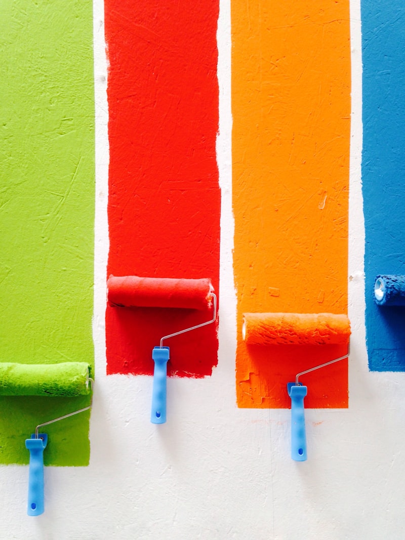
What Different Colors Communicate
Understanding general color associations gives you a foundation for making intentional choices. Here are the most commonly used colors in web design and what they tend to communicate.
Blue: Trust and Stability
Blue is the most popular color in web design, and for good reason. It is associated with trust, reliability, professionalism, and calm. Financial institutions, technology companies, and healthcare brands lean heavily on blue because it communicates competence without aggression. Think about the branding of PayPal, Samsung, and LinkedIn. Blue is safe, but safe is not always a bad thing when trust is your primary goal.
Red: Urgency and Energy
Red grabs attention faster than any other color. It communicates urgency, excitement, passion, and importance. E-commerce sites use red for sale banners and limited-time offers because it creates a sense of immediacy. However, too much red can feel aggressive or alarming. Use it strategically for CTAs, notifications, and elements where you want to drive immediate action.
Green: Growth and Reassurance
Green signals growth, health, success, and safety. It is the universal color of "go" and works exceptionally well for confirmation messages, success states, and brands in health, finance, or sustainability. In African markets, green also carries associations with prosperity and agriculture, making it a strong choice for businesses in these sectors.
Orange and Yellow: Optimism and Attention
Orange combines the energy of red with the warmth of yellow, creating a sense of enthusiasm, creativity, and friendliness. Yellow communicates optimism, clarity, and warmth. Both are excellent for highlighting important elements without the intensity of red. They work particularly well for calls to action on sites that use cooler primary colors.
Purple: Premium and Creative
Purple has long been associated with luxury, creativity, wisdom, and sophistication. It is a strong choice for brands that want to communicate premium positioning or creative innovation. Many beauty, wellness, and creative agency brands use purple tones effectively.
Black and White: Sophistication and Clarity
Black communicates elegance, power, and sophistication. White communicates clarity, simplicity, and space. Together, they create high-contrast designs that feel premium and modern. Luxury fashion brands and minimalist tech companies use black-and-white palettes to let their products speak for themselves.
Cultural Considerations That Matter
Here is where color psychology gets nuanced, and where many businesses get it wrong. Color meanings are not universal. They vary significantly across cultures, and if your audience is diverse, you need to account for this.
White, for example, symbolizes purity and weddings in Western cultures but is associated with mourning in several East Asian cultures. Red signals danger or urgency in the West but represents luck and prosperity across much of Asia and in some African traditions.
For businesses serving African audiences specifically, consider these associations:
- Green carries strong positive associations with fertility, land, and national identity across many African nations (it features prominently in the flags of Nigeria, Ghana, Kenya, and many others)
- Gold and yellow are associated with wealth, warmth, and prestige
- Red can signify sacrifice, struggle, and strength in many African cultural contexts, alongside its universal attention-grabbing properties
- Earth tones (terracotta, ochre, deep browns) resonate with cultural heritage and authenticity
If you serve a global audience, test your color choices with users from your target markets. What feels professional in one culture might feel cold or aggressive in another. The safest approach is to rely on your brand colors for identity and use universally understood color conventions (green for success, red for errors) for functional UI elements. Research from the Institute for Color Research shows that color increases brand recognition by up to 80%, which underscores why getting these choices right matters so much.
Color Psychology in CTAs and Conversion Optimization
Your call-to-action buttons are arguably the most important colored elements on your website. The color of your CTA button can significantly impact click-through rates, and the research backs this up.
The key principle is contrast, not a specific color. A red button on a red-themed site will not stand out. A green button on a blue-themed site will. Your CTA button needs to be the most visually prominent element in its vicinity. Understanding how good UX design increases conversions means recognizing that color is one of the most powerful levers you have.
Here are practical guidelines for CTA color optimization:
- Choose a color that contrasts sharply with your background and surrounding elements. If your site is predominantly blue, an orange or yellow CTA will command attention.
- Stay consistent. Use the same CTA color across your entire site so visitors learn to associate that color with action.
- Test secondary CTAs with softer variants. Your primary CTA ("Get Started") should be bold and high-contrast. Secondary CTAs ("Learn More") can use outlined or muted versions of the same color.
- Do not rely on color alone. Pair color with clear, action-oriented text. A bright button that says "Submit" is less effective than one that says "Start Your Free Trial."
One well-documented case study from HubSpot found that changing a CTA button from green to red increased conversions by 21%. But context matters. The page had a lot of green in its design, so the red button simply stood out more. The lesson is not "use red buttons." The lesson is use whatever color creates maximum contrast in your specific design.
Accessibility and Color Contrast
Approximately 8% of men and 0.5% of women have some form of color vision deficiency. If your website relies on color alone to communicate information, you are excluding a meaningful portion of your audience.
The Web Content Accessibility Guidelines (WCAG) specify minimum contrast ratios between text and background:
- 4.5:1 for normal text
- 3:1 for large text (18px bold or 24px regular and above)
- 3:1 for UI components and graphical objects
Beyond contrast ratios, follow these principles:
- Never use color as the only indicator. Error messages should include icons and text, not just red highlighting. Success messages should say "Complete," not just turn green.
- Test with color blindness simulators. Tools like Chrome's built-in accessibility inspector or the Stark plugin for Figma let you see your design through the lens of different color vision deficiencies.
- Ensure sufficient contrast between interactive elements and their backgrounds. Buttons, links, and form fields all need to be clearly distinguishable.
Accessibility is not just a legal consideration. It is a business consideration. Every user who cannot interact with your site because of poor color choices is a potential customer lost. A thoughtful UI/UX design process catches these issues before they reach production.
Practical Tips for Building Your Color Palette
If you are starting from scratch or rethinking your current color scheme, here is a structured approach.
- Start with your brand color. This is the single color most associated with your brand. It should reflect your industry, values, and the emotion you want to evoke. Your color choice is central to building a brand that stands out in a crowded market.
- Add a neutral base. Most of your website will use neutrals: whites, grays, and near-blacks for text and backgrounds. Choose neutrals with a slight warm or cool undertone that complements your brand color.
- Choose an accent color. This is your CTA and highlight color. It should contrast strongly with both your brand color and your neutrals.
- Define semantic colors. Green for success, red for errors, yellow for warnings. These functional colors should work harmoniously with your palette but remain distinct from your brand and accent colors.
- Limit your palette. Three to five colors plus neutrals is enough for most websites. Too many colors create visual chaos and weaken your brand identity.
- Test in context. Colors look different on screens than in a design tool's color picker. Always evaluate your palette on real pages, with real content, across multiple devices.
Color Is Strategy, Not Decoration
The next time you look at your website, pay attention to what the colors are doing. Are they guiding attention to the right places? Are they building the emotional response you want? Are they accessible to everyone who visits?
Color is not the first thing most business owners think about when planning a website. But it is one of the first things their visitors notice. Getting it right is not about following trends. It is about making deliberate choices that serve your brand, your audience, and your goals.
If your website's colors are working against you instead of for you, it might be time for a strategic redesign. Let us help you build a website where every detail, including color, works toward your business goals. Our UI/UX design team brings both creative instinct and data-driven rigor to every color decision.